Mapping the Garbage Epidemic in NYC
This project analyzed NYC Department of Sanitation data to evaluate the city's Zero Waste Plan. Using spatial analysis and density mapping, I traced where NYC's trash actually goes — mapping landfill catchment areas, transfer station networks, and the spatial relationships between waste generation, recycling infrastructure, and income.
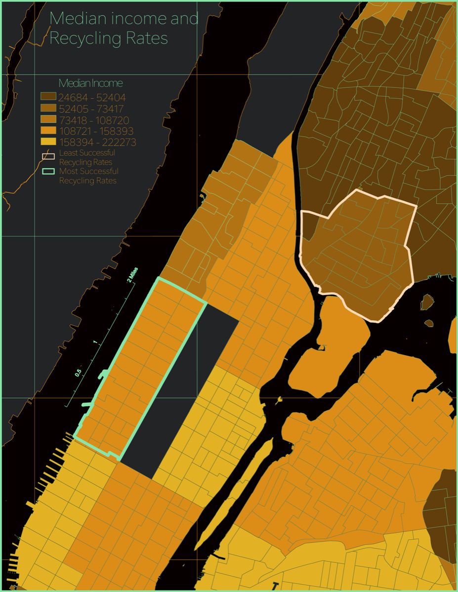
The analysis revealed how recycling infrastructure gaps and declining material recovery rates disproportionately affect low-income neighborhoods — turning waste data into an equity argument.
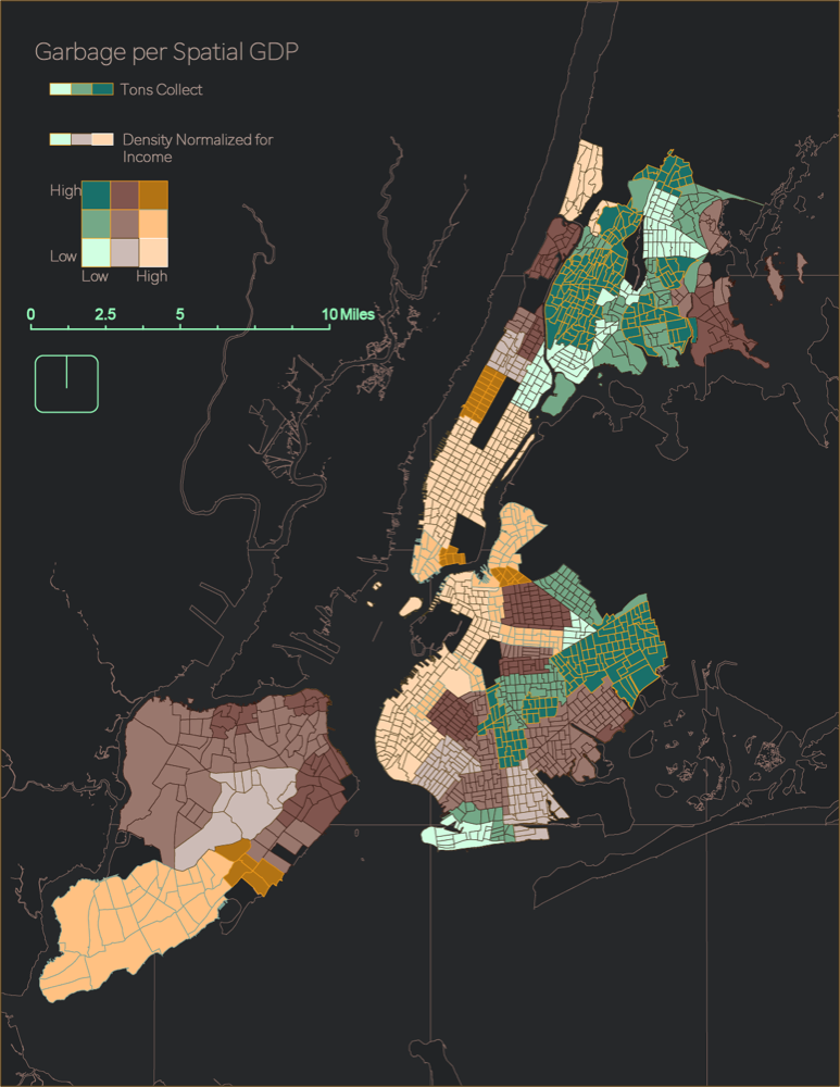
Garbage per Spatial GDP
A bivariate choropleth mapping tons of refuse collected against density-normalized income. Low-income, high-waste neighborhoods cluster in the Bronx and northern Brooklyn — the spatial signature of environmental inequity.
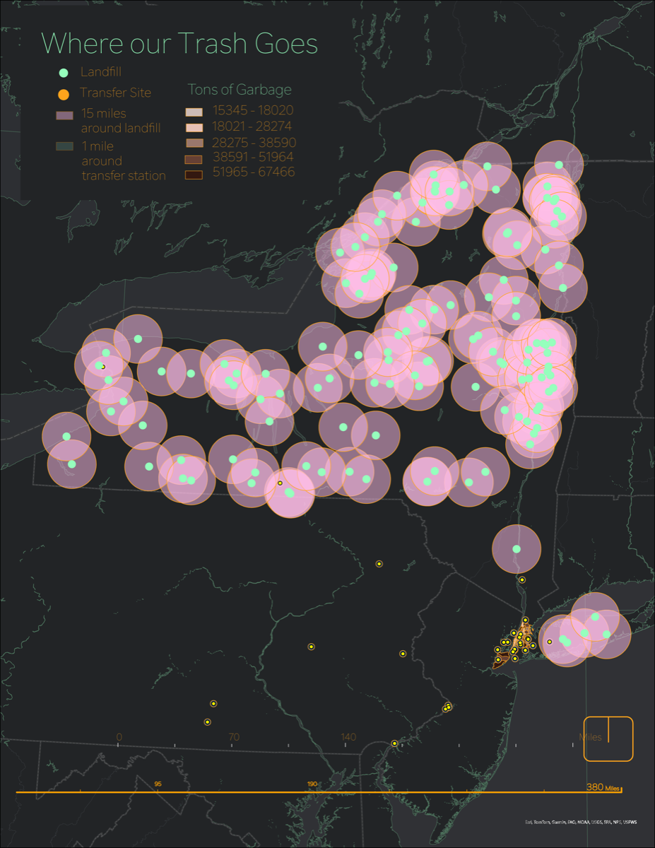
Where Our Trash Goes
NYC's waste travels hundreds of miles to landfills across the northeast. Transfer station catchment areas reveal how waste infrastructure concentrates environmental burden in specific communities.